For this week’s assignment, we had to find a website, use that website’s content, and redesign it with three different looks.
I chose Parken Kjøpesenter, because I’m familiar with from when I grew up, and the website could use some improvement.
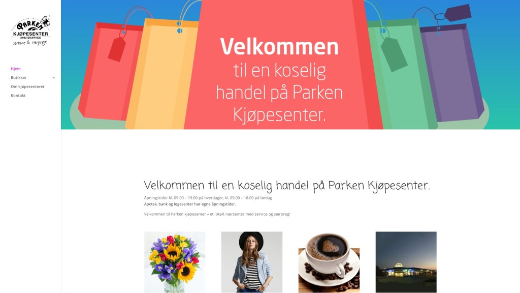
This is the original page:
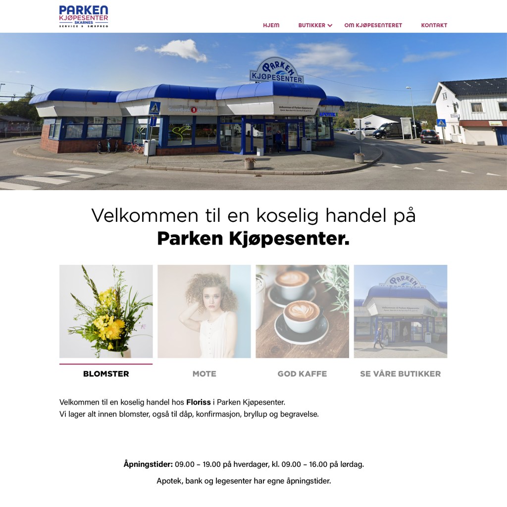
Neat and inviting
The first thing I wanted to do, was to create a nice base to work from, something that they should consider changing to. The logo was so outdated, that I had to quickly redesign it to something that is more fitting for a “mall”, while keeping the original intent. Some of these pictures have been cropped too much, so I had to find replacements for these as well, and they seemed to be stock images, so it didn’t really matter if I found new ones. The images of the “mall” were so bad, that I just used Google street view for new ones. I tried to use the same colors that they use for the their brand (it used to be purple and pink, but they have faded(see the sign) or have been removed)
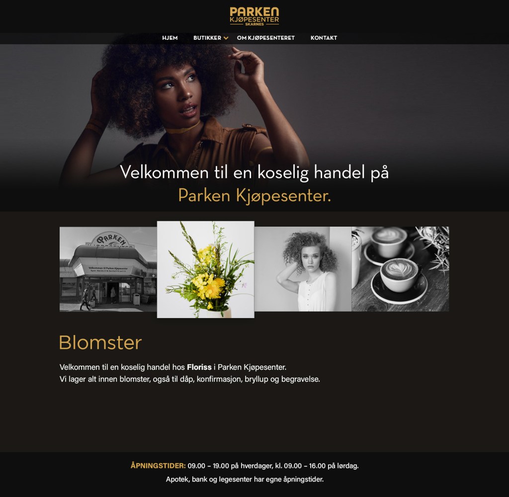
Exclusivity and style
This style is more for the assignment’s sake, because it’s not their style at all. Here I tried to create an air of exclusivity, by using black and gold and a more modern font. As there were almost no good original images, I used a stock photo for the hero image.
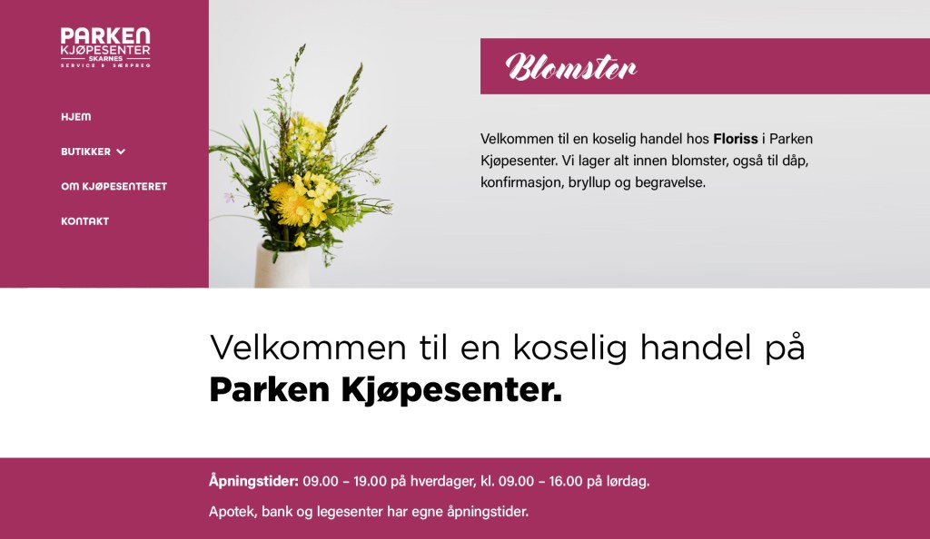
Minimalistic and experimental
For this one I just tried to move the navigation to the side instead. I wanted to create a simple and easy feel to the page, that gives a feeling of being home. Keywords: knitting, flowers, reading, age groups 50 and up.

Leave a comment