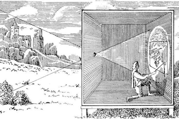
For this week's learning activity, we picked three events in the timeline from this week's lesson History of Photography: An Introduction, and were asked to write a paragraph for each of those events. The Camera Obscura Image from The Dark Room Academy. Camera obscura (latin: dark chamber) is a natural optical phenomenon that occurs when an... Continue Reading →
Color Theory Part III: Book Cover
The final part of this week's Learning Activity was a lot of fun and hard work! We got to choose from three different books, and then illustrate the cover of that book with a set of rules: Design a book cover for one of the following:a.) “Rosemary’s Baby” by Ira Levin: use complementary colours to express anguish... Continue Reading →
Color Theory Part II: Color Effects
This is the second part of this week's Learning Activity: Use a colour photo of your choice and create the following colour effects – you should hand in four separate works of the same photo with the following effects:- Create a fluorescent duotone- Apply a monochrome look- Split toning of the image- Freestyle: Create a colour effect... Continue Reading →
Color Theory Part I: Systems and Schemes
The RGB and CMYK color systems explained RGB The RGB color system is an additive system, meaning that you add the primary colors: red, green and blue, to get white, which is the "color" of light. By mixing the colors with each other one time, you will get the secondary colors: cyan, magenta and yellow.... Continue Reading →
Design a Gig Poster
Designing a poster The last part of this week's Learning Activities was to create a gig poster for a fictional band, tour and concert. I brainstormed around the name a bit, and decided that this is a post-rock/pop band, and then I used design elements based on the name. A keystroke is a term used... Continue Reading →
The Anatomy of Type
The second Learning Activity of this week was about explaining the anatomy of type, or how a typeface is put together. We were to explain these parts in a visual way, so I started making a diagram, with the Times New Roman typeface. This diagram is based on information from the book: Graphic Design School,... Continue Reading →
Expressing Meaning
The first of this week's Learning Activities is focused around arranging text, in a creative way, emphasizing it's meaning. First we got to make up our own word, one which doesn't exist. So I ended up with Playhem! This is the combination of the words Play and Mayhem, which is the moment during play-time when... Continue Reading →
Create a logo using Gestalt Principles
Introduction This week's final Learning Activity is based around the Unilever logo. I will analyze the logo, then create my own versions of it, using the Gestalt Principles, which I've also used in a Mandatory Assignment from earlier post. Analyzing the Unilever logo The Unilever logo is a monogram or lettermark logo. The overall U-shape... Continue Reading →
Understanding Ideals
Introduction For this double week (week 4 & 5 of the course), we learned how to analyze different brands. For this Learning Activity we were to visit a popular store, and analyze its brand ideals, and evaluate how they remain true to their brand identity, or how they don't. I chose to visit Dressman, one... Continue Reading →
Understanding Positioning
Introduction For the first Learning Activity from these two last week we were going analyze three logos and figure out what their Brand Positioning is. We were to take this even further by taking a deeper dive into Apple's iPhone brand. I will copy the assignment text to frame my analysis. Brand Positioning 1. Look... Continue Reading →