Introduction
The first part of this Mandatory Assignment was to come up with a name for a dog food product, and creating a logo for said product, by exploring, sketching and twisting the brain.
The first names I came up with were already taken, with names such as Zoë (life) and Sirius (dog star). The name ended up as a combination of the Latin words: Canis (from canis familiaris, which is a dog) and Cibum (food). Canis + Cibum = Caci.
Now that the name was set in stone/print, I went ahead and did some sketches.
Exploration
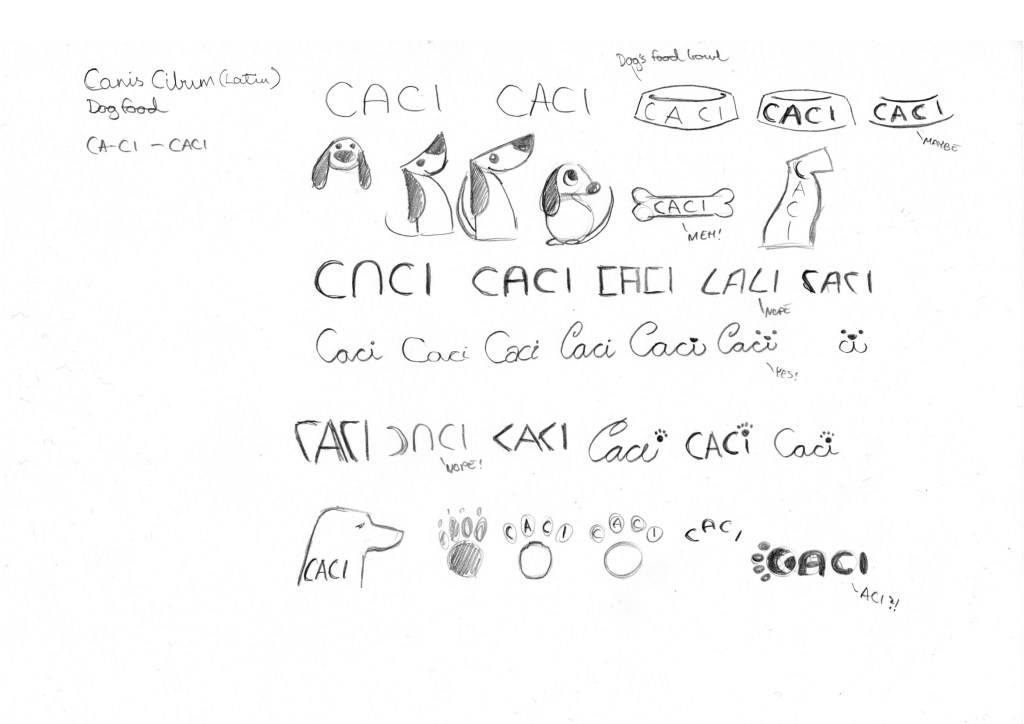
Use sketching techniques to draw thumbnails and hand in your thumbnails as scanned PDFs.
Focus
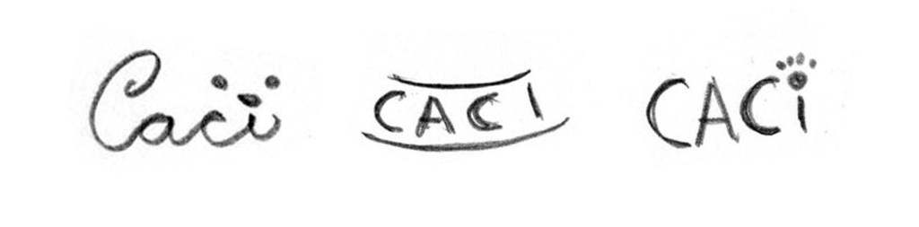
Highlight three of the thumbnail ideas that you consider the best options and state why. Hand in an A4 with visuals of the three chosen thumbnails; include reasons for choosing each of these three options.
My reason for choosing these three are because they are simple, and they have some abstraction of something related to dogs. The first, which I like the most, uses the C as a tail for the dog, and the dot over the ‘i’ is the snout. The second is an abstraction of a food bowl, and it looks very clean and simple, but I’m not sure if it gets the message across. The last one is using lowercase for the ‘i’ and it’s used to illustrate a footprint, which might be a bit cliché.
Construction
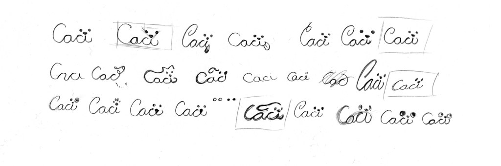
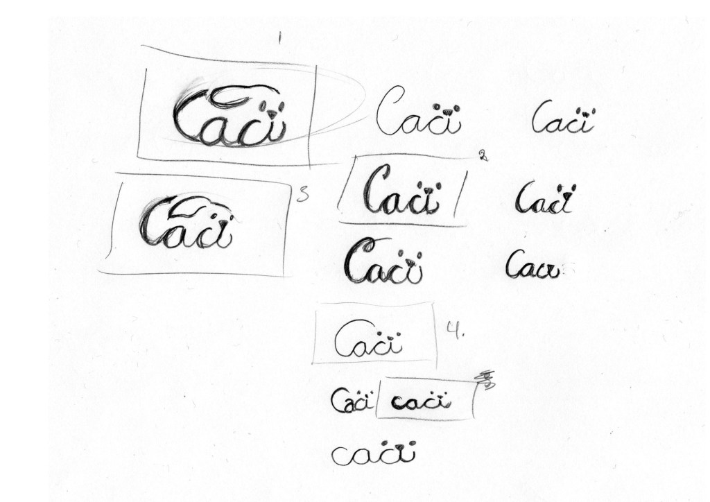
Use sketching techniques and redraw ONE of your chosen concepts until you’ve reached a conclusion on a successful logo. Hand in your drawings as scanned PDFs.
Testing
Experiment more with your favourite options from Step 3 and ask the opinion of a few people. Hand in examples of the logos shown to people and write their feedback or opinion on each.
Feedback person 1:
- Looks like a dog, and you can also see from a distance that it is a dog. The dog looks a bit “on the go” due to the ears, perhaps towards the yummy food, or that the food is for an active dog.
- I like that the ‘C’ looks like a tail, and the dog’s face is clear, on some of the other examples it may look more like a foreign letter with two dots above, while here you see the face immediately.
- I likes that it looks like a dog, maybe even clearer than in No. 1, even though it is not in speed, but the square ears makes it hard to misinterpret that it is a dog and not just a curl on the letters as in No. 1.
- I like this best, because it is minimalist, but at the same time a clear shape like a dog, and the face is also clear.
(Person changed opinion about 4 and chose 3 instead)
Feedback person 2:
- No. 1 looks to me like a running dog, without so much personality, but a great way to get the brand name together with a dog.
- Very sweet, gentle dog, with more focus on the name than the dog in the logo. Gives a good feeling of a gentle dog.
- I think I liked this the best. Clean lines, the dog looks kind, the “message” comes across in a clear way for me. I like the design of the dog with the shape of the ear, smile, eyes and that the ‘c’-tail does not go as much towards the head as No. 1.
- It reminds me a little about a turtle and something that curls up. Maybe a cat.
Feedback person 3:
- No. 1 looks like a happy dog in a rush to get somewhere. It’s cute, but the text is a bit hard to read.
- This is very readable and you can still see that it’s a dog.
- This looks like a happy dog, and easier to read than No. 1, but it’s still a bit difficult to read the text-
- This is very similar to No. 2, but “thinner” and more minimalistic. I don’t know if I like the ‘C’, because it looks more like an extension of the ‘a’
Refinement
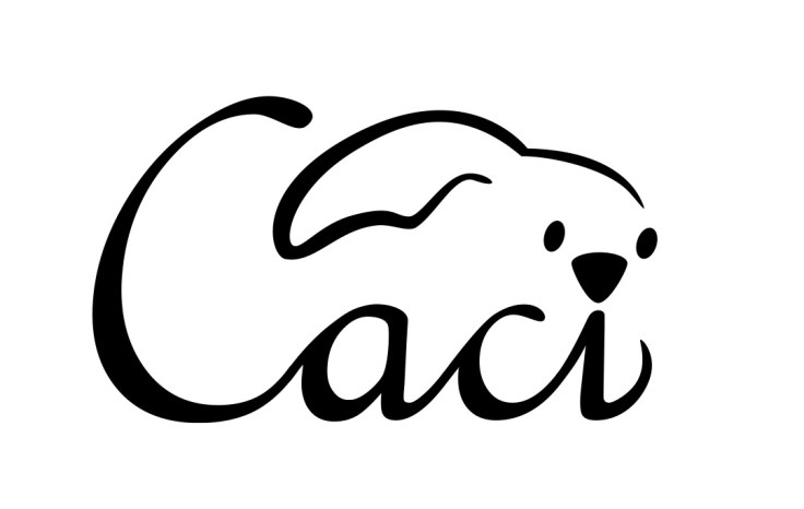
Choose your final design and execute it in Adobe Illustrator, along with the name of the product. Hand in your final logo as an A4 PDF.

Leave a comment