
This reflective journal entry will put four learning activities together, because they are all about composition. I will use what I’ve learned in these activities to make a brochure, which you can read about in Layout II.
Form and Space
| Cut out a series of shapes from black paper – squares, rectangles, circles and random shapes – in a variety of sizes, from small to large. Working with a square piece of white paper, place shapes of different sizes into the white space; place them on the white one at a time and move them around. Try to find the point where the distinction between figure and ground becomes unclear. Does it depend on which shape dominates the space: black or white? Is it about the position of the shape within the space? Think about how important figure-ground relationships are within composition and design. |
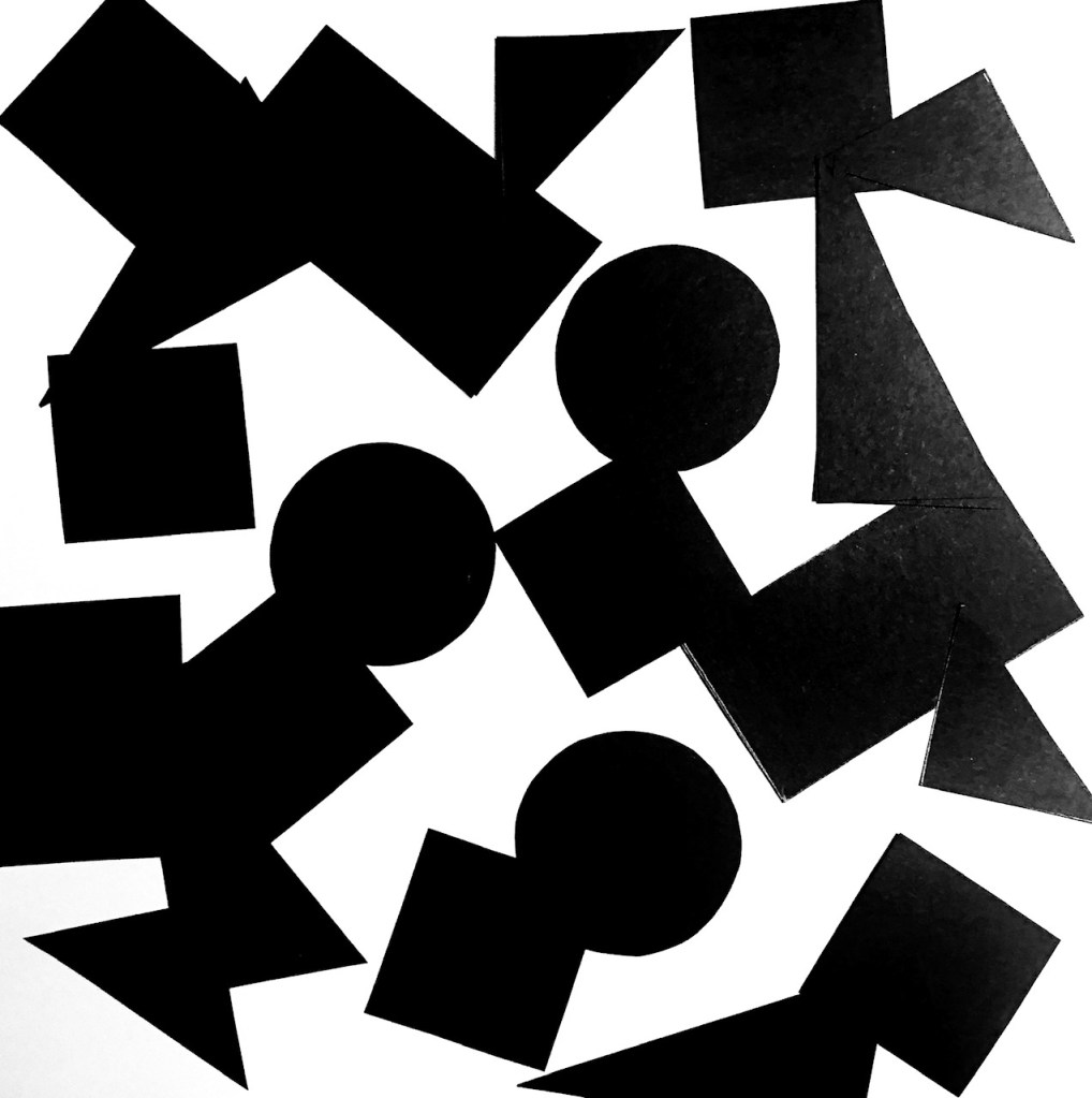
I tried to approach this task in two ways, one was to make patterns out of the shapes, the other was to use the same amount of shapes and lay them randomly on the paper. It seems like a fairly equal amount of black and white makes the figure-ground relationship become unclear, but it’s even more evident in the examples where I made patterns.
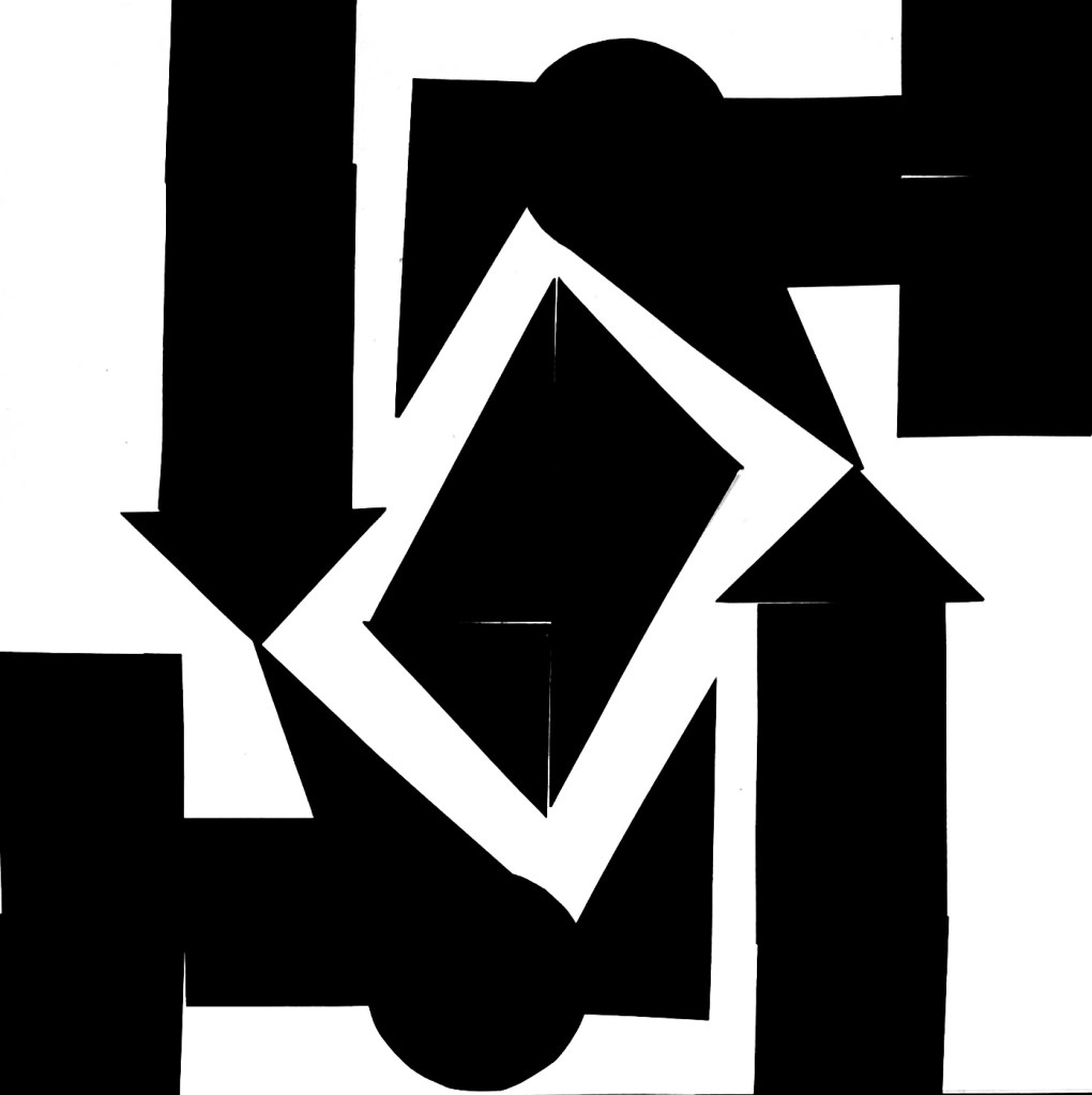
Symmetry/Assymetry
| In this assignment, you will be given the opportunity to also test your idea sketching skills. It is important to start working with basic ideas on paper and develop your concept from there on out. Draw one or two squares or rectangles in each empty square to achieve the following visual effects (refer to your textbook, p.41 as guidance). You can work with the interaction of rectangles and squares to make the balance or imbalance more evident. Entering left Movement to the right Movement to the left Movement downwards Movement upwards Balance Tension Symmetry/asymmetry Produce at least two different versions of each effect, recording your results each time. Explain in one or two sentences what you wanted to achieve (as shown in your manual). |
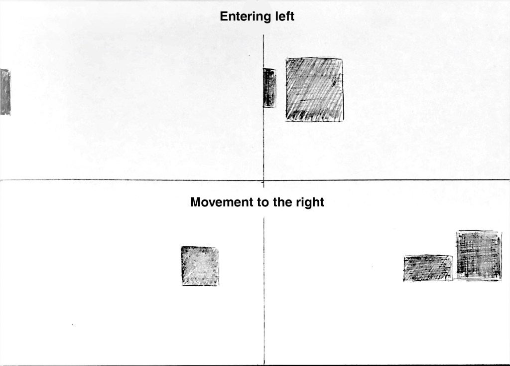
Here I tried to push a rectangle to the edge of the paper, to make it appear as if it’s entering left. I applied the same method to the other example, but added a square which has already entered.
For movement to the right I just put the objects to the right in the frame, with the biggest square “leading” the way.
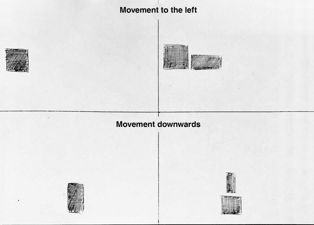
I used the same technique for movement to the left and downwards, as described in the previous example.
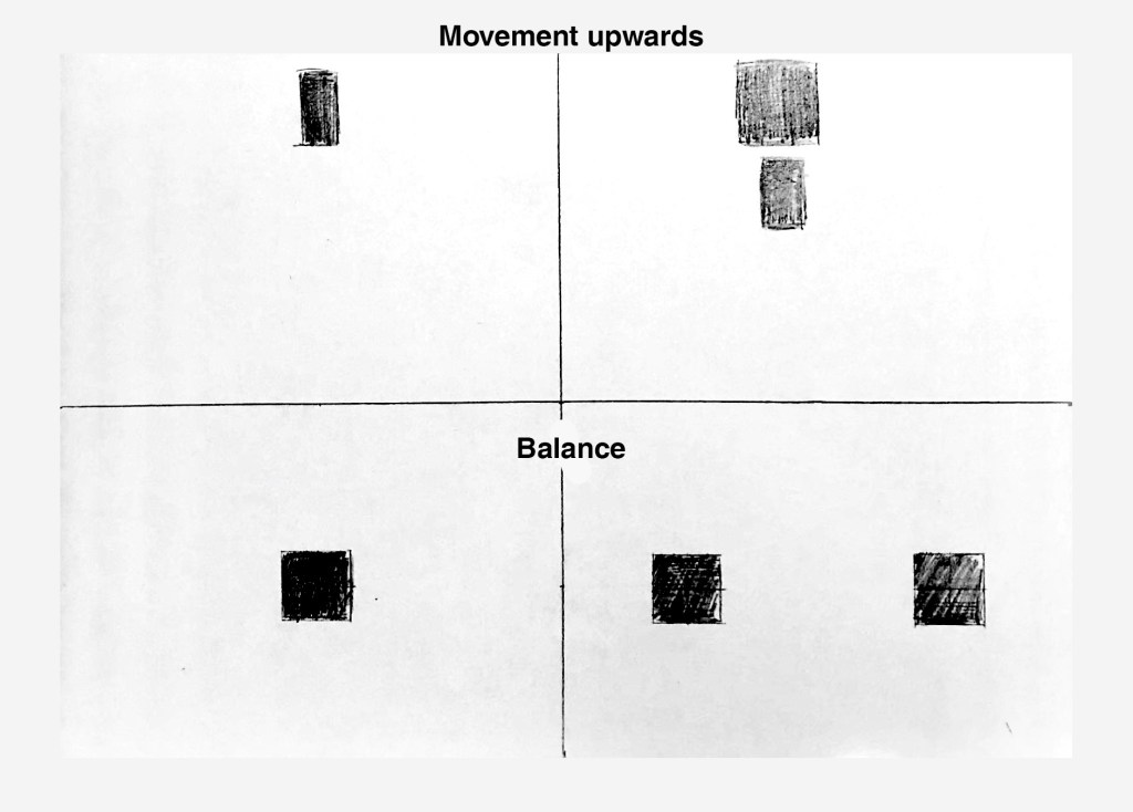
Same thing yet again for movement upwards.
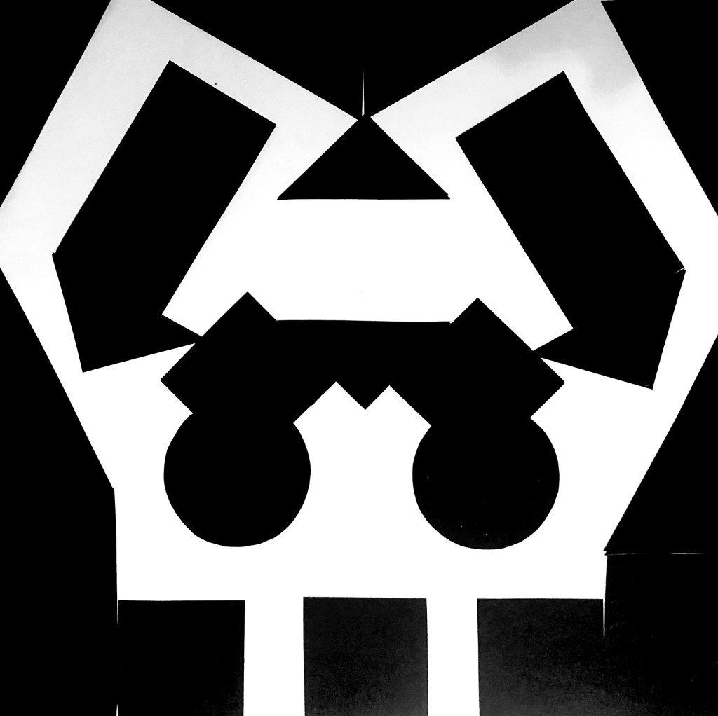
For balance I just illustrated it in the simplest way possible, but this could also apply to symmetry.
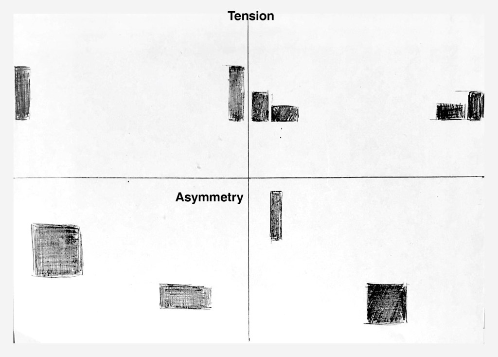
The two rectangles are pushing to the edge of the frame, as far away from each other as possible, thus creating tension.
For asymmetry I just mixed up the size of the rectangles and put them off-center. I accidentally created balance with the one to the right,
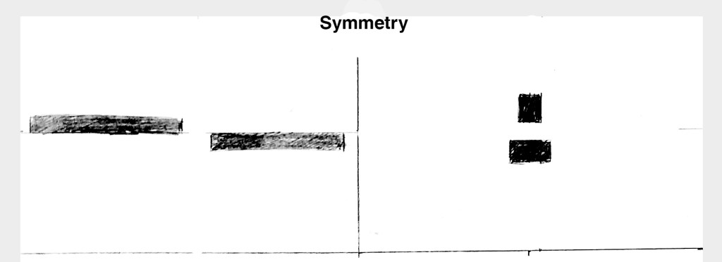
Here are two examples of symmetry. Each of the two shapes in the examples to the left are placed in the same distance from the center, and on opposite sides from the middle.
The second example is just two shapes placed perfectly in the middle.
Basic Principles of Layout
| Take a magazine, newspaper or book that includes images and text. Lay tracing paper over the top of three spreads (both left-hand and right-hand pages). Using a pencil and ruler, carefully trace the grid underlying the page layouts. Remember to remove specific text elements or images, and to only draw the grid lines. Note column widths and margin sizes at the top, bottom, and to the left and right of the main body of text. Is your document based on a two-column, three-column, or another type of grid? Which elements stay the same on each page, and which change? |
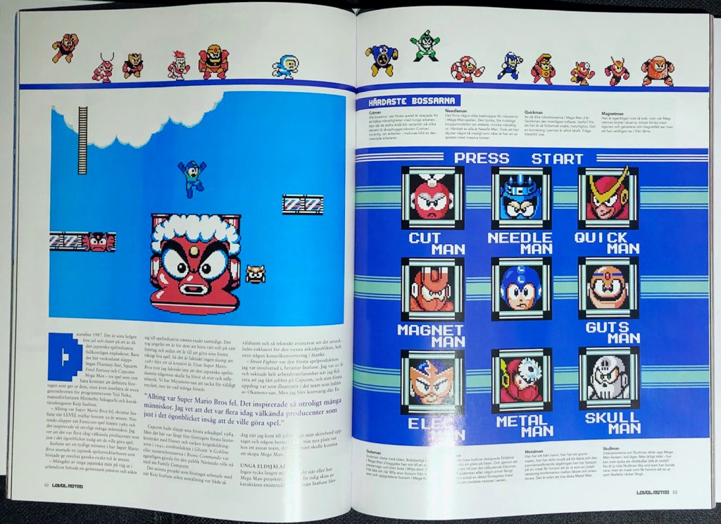
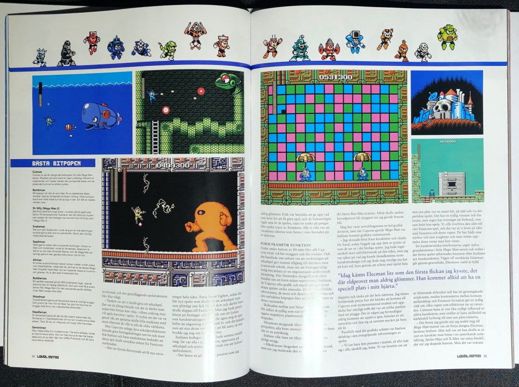
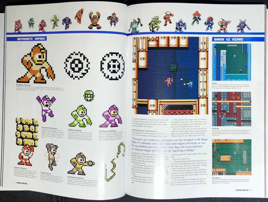
I chose to use Level Retro – Volume 2, a bookazine which collects several articles previously released in a Swedish gaming magazine called Level.
Here are the original pages:
And these are my tracings:
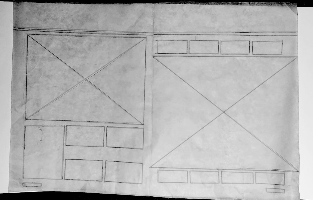
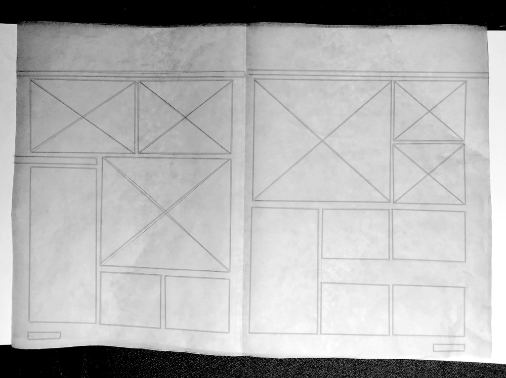
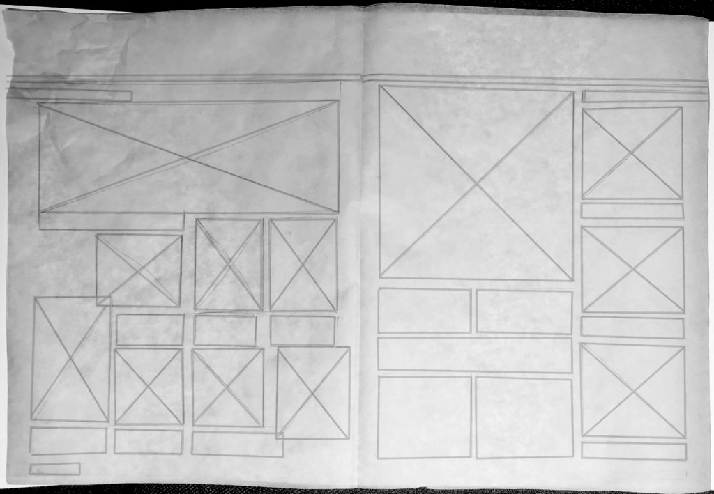
As you can see the article is quite image-heavy. In most cases the images take up at least half the page. The text is written in a three-column grid, with a quote inset in the middle of two of the columns This is used for 2/3 of the pages, with 1/3 used primarily for images, and possibly a four-column grid. The third column is used for a reference list on one page, and for images on another page. All the images follow (mostly) the grid set up by the three columns.
Pace and Contrast
| Compare the design (in terms of pace and contrast) of an online magazine, blog or website to that of a printed magazine, book or journal. What differences can you see between the kinds of design strategies used in the two formats? |
My first observation is that a printed magazine usually follows a grid, and read from the left to the right, with text and images leading the eye. Creative composition is fundamental in print, and is used to create pace, movement and rhythm, and to lay out the elements in a way where they don’t compete with the viewers attention.
A blog or online article follows the natural way of scrolling down web pages, read continuously from the top to bottom, until the end of the text. While many of the rules for pace in print doesn’t apply to digital publications, the designer still has to lay out the elements so the reader is engaged. This can be done by adding images, videos and quotes, to break monotony.

Leave a comment