Designing a poster
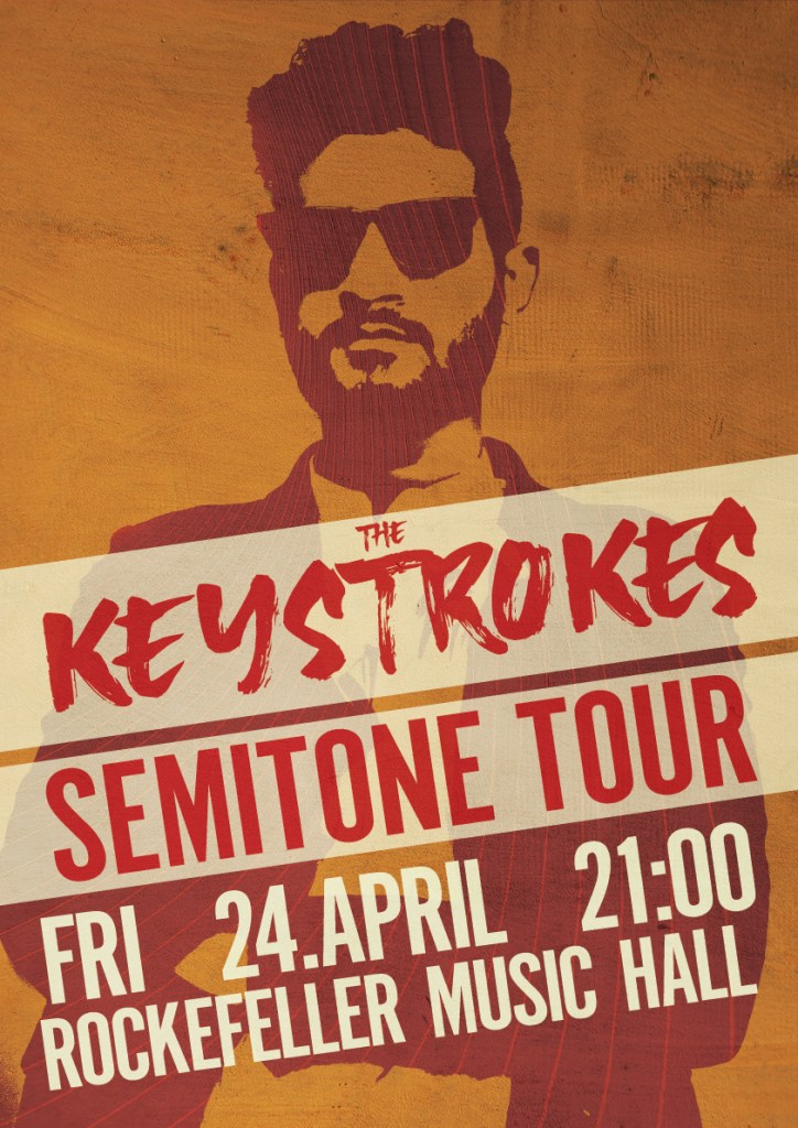
The last part of this week’s Learning Activities was to create a gig poster for a fictional band, tour and concert. I brainstormed around the name a bit, and decided that this is a post-rock/pop band, and then I used design elements based on the name. A keystroke is a term used in computer usage, but I saw it more as a play on words, so I used a brushstroke typeface for the band name, with a background that kind of looks like piano keys. For the silhouette I used a stock photo of a man, adjusted the threshold, and then found a suitable color palette for the entire poster. The inside of the silhouette was done by exploring the piano element even further, and represent warped piano strings, also from a stock photo. The entire poster has a grungy texture layer, to emphasize that they play rock.
The text is aligned to an invisible rectangle, which is something I learned by watching a LinkedIn tutorial.
The Pamphlet/Flyer
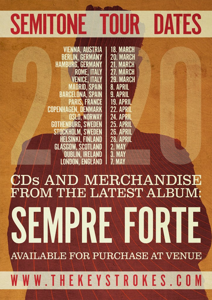
For the pamphlet I used the poster as the front, but flipped the design for the back side. The silhouette is now filled in, and we see the person from the back. This also made it easier to add text to the background.
I first tried to add the year at the end of the dates, but it just looked messy, so I added 2020 as a background element instead.

Leave a comment