Introduction
For this double week (week 4 & 5 of the course), we learned how to analyze different brands.
For this Learning Activity we were to visit a popular store, and analyze its brand ideals, and evaluate how they remain true to their brand identity, or how they don’t. I chose to visit Dressman, one of the biggest men’s fashion brands in the Nordic countries.
Question 1
| What brand identity element are they using in their logo (e.g. abstract mark or word mark)? |
The Dressman logo is a word mark logo, with a simple and elegant typeface, like their clothing. They have chosen a bold red serif font, on a black bakground (in some cases white). The name itself tells us that they, among other things, sell suits.
Question 2
| What do you think their brand ideal is? |
They offer Affordable Quality (“value for money”), while also ensuring the textile workers have safe work and production environments.
Timeless clothing, which are stylish, traditional and uniform.
They have proven to be Diversive, by offering sizes up to 9XL, in a wide variety of colors.
They have a strong focus on Sustainability, by using no harmful chemicals in the production, they have teamed up with Fretex to repurpose or recycle clothes, they source sustainable materials for their clothes, even making clothes out of recycled nylon from the ocean.
Question 3
| How do they remain true to their brand ideal within their shops? |
I think that they actually succeeded in keeping their ideals in the shops, which I will explain in some pictures I took. Fortunately there were no people in the store, because of the Corona-outbreak, so I had “free access”.
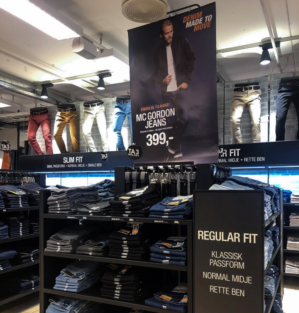
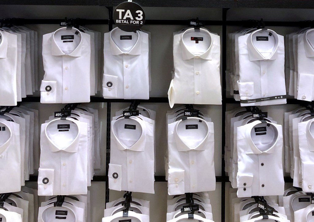
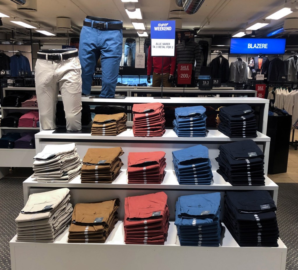
Affordable Quality
As you can see, their ideal Affordable Quality (Or value, as in “value for money”) is present, with a lot of 3 for 2 signs, and products on Sale. The clothes are also pretty durable and stylish, so you get value for your money. They have also placed signs that tell you that the products are of high quality, or can be used together with their other products.
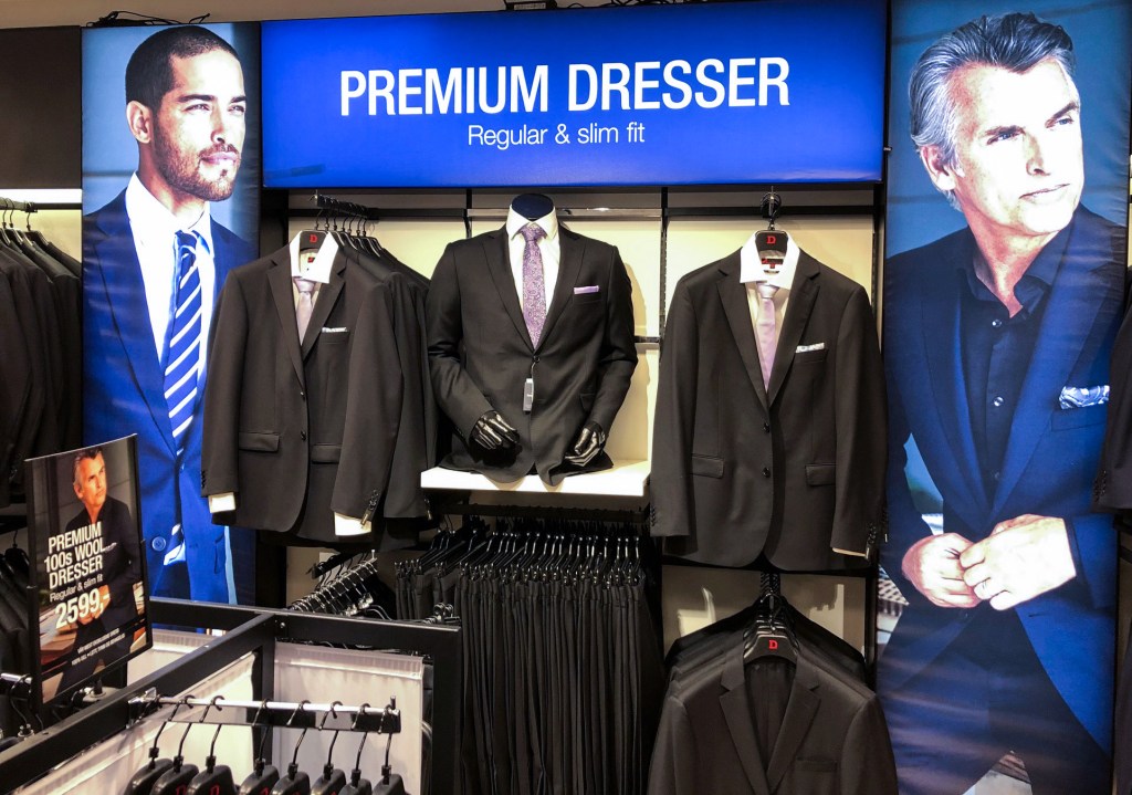
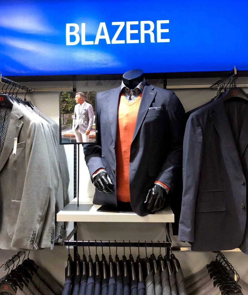
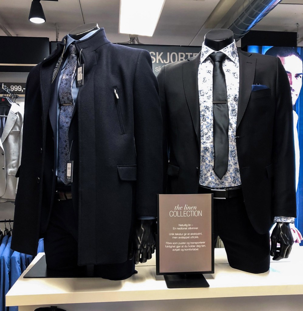
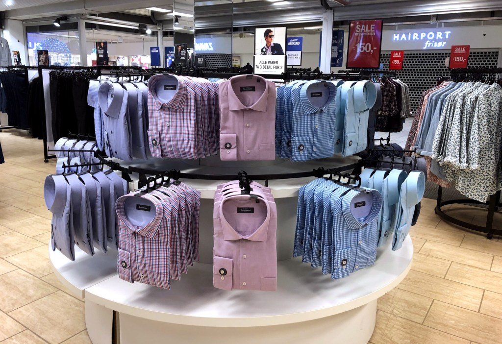
Timeless
Here are some of their Timeless clothing, which are stylish, traditional and uniform. They also have sweaters, shirts, jeans, pants, boxer shorts, socks etc. in the same classic style. (Notice the 3 for 2 sign again)
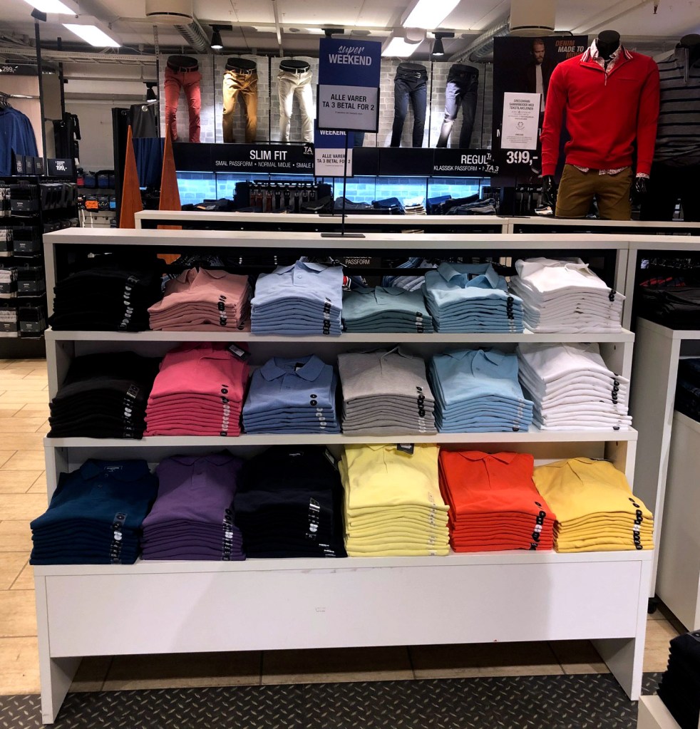
Diversive
Dressmann caters to a lot of different people. Even though their clothing style is classic, they do come in a broad selection of colors and sizes (up to 9XL), which expands their customer group considerably.
Sustainability
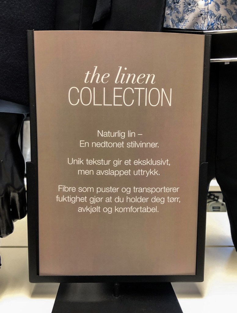
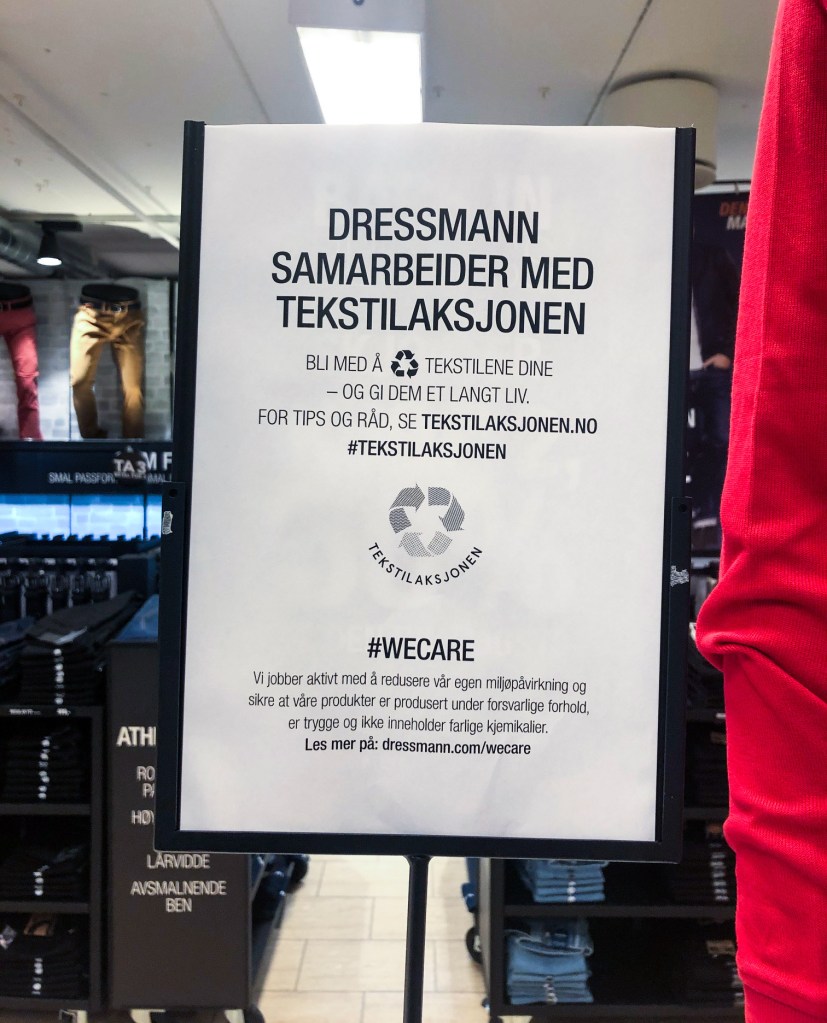
Sustainability might be the ideal that is the least represented in the physical store that I visited, but it’s pretty detailed on their webpages. However this sign was placed in the middle of the store, so it was almost impossible not to notice it. “Tekstilaksjonen” is just one of the measures under the #WECARE “mission”.
Question 4 (and summary)
| Evaluate the customer experience according to the brand ideal. (For example, if the brand ideal is “innovation”, do you get a sense of that ideal when you visit the outlet?) |
Like I observed in the previous question, their brand ideals are present in the physical store. If I were to condense their ideals it into one word, it would be Value. All the clothes were placed neatly and reflects their promotional pictures, and their webpage. The woman behind the counter told me that they had guidelines for how to decorate and place items in their store.
A thing I noticed on all written material in the store, is that they used a sans-serif font, similar to Helvetica, on everything. This is in contrast to the typeface they use for their logo. This is used together with images of posing models, and makes it seem like their products are more expensive than they actually are, which again is one of their ideals: Affordable Quality, or Value.

Leave a comment