
Introduction
This week’s final Learning Activity is based around the Unilever logo. I will analyze the logo, then create my own versions of it, using the Gestalt Principles, which I’ve also used in a Mandatory Assignment from earlier post.
Analyzing the Unilever logo
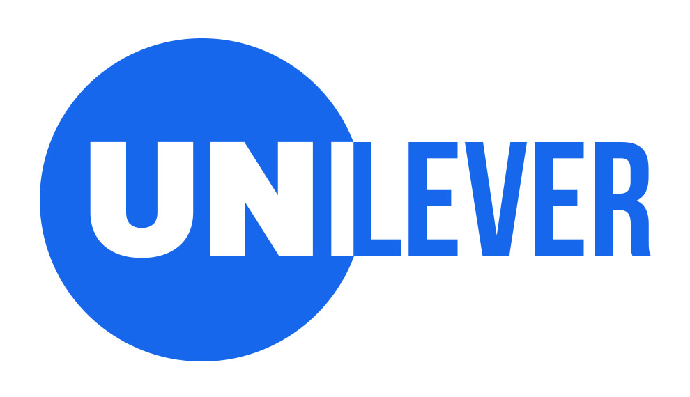
The Unilever logo is a monogram or lettermark logo. The overall U-shape consists of 25 different icons, each representing an aspect of their business. Each icon has been simplified into an abstract version of what they represent. This unifies the whole composition, when they’re put together. They use a “muted” or desaturated blue color for the logo and the text, which is calming and neutral.
My personal association with the logo used to be “soap”, and nothing else, but when I looked closer, I saw that there was more to the company than just soap.
The Gestalt Principles used in the Unilever logo
There are quite a few Gestalt Principles at work in the Unilever logo. First and foremost is Prägnanz, which is the simple shape of the U. All the abstract shapes are placed tightly together, using the principle of Proximity. There is some Figure/ground relationship in the smaller icons. Most of the icons follows the Common Fate principle, starting with the “explosion”, curving at the bottom, and then ending with the dove at the top.
Recreating the logo using Gestalt Principles
The final task of this Learning Activity is to recreate three versions of the Unilever logo, using the Gestalt Principles, I will also show my sketches that led to the final logos. I chose, Similarity, Continuation and Closure, but ended up using more principles in each of them.
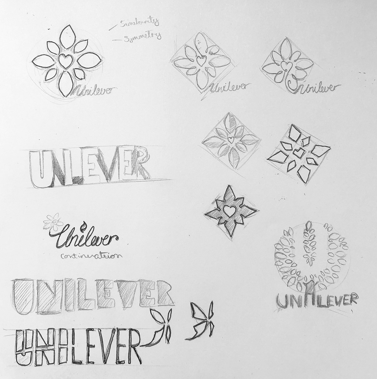
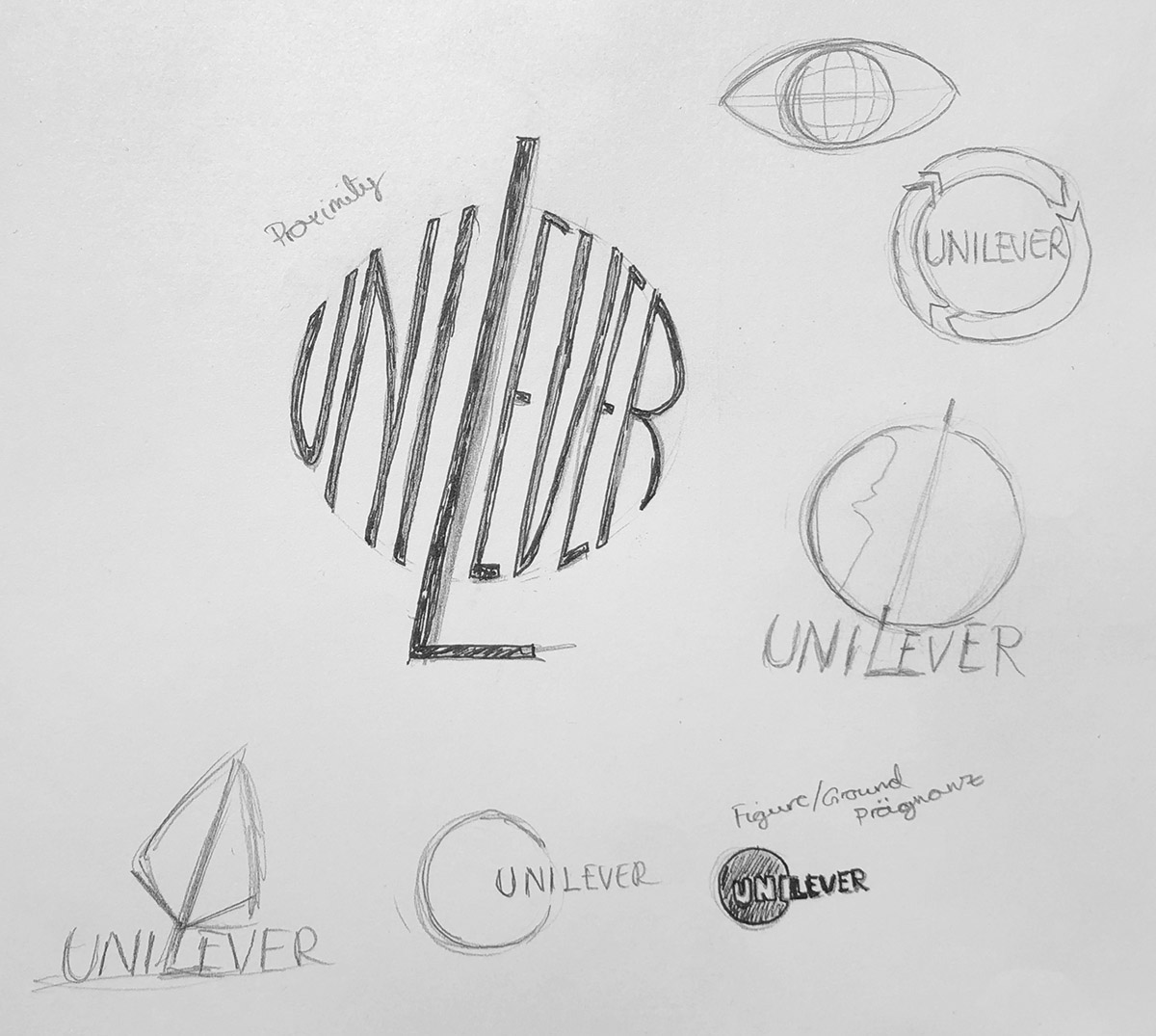
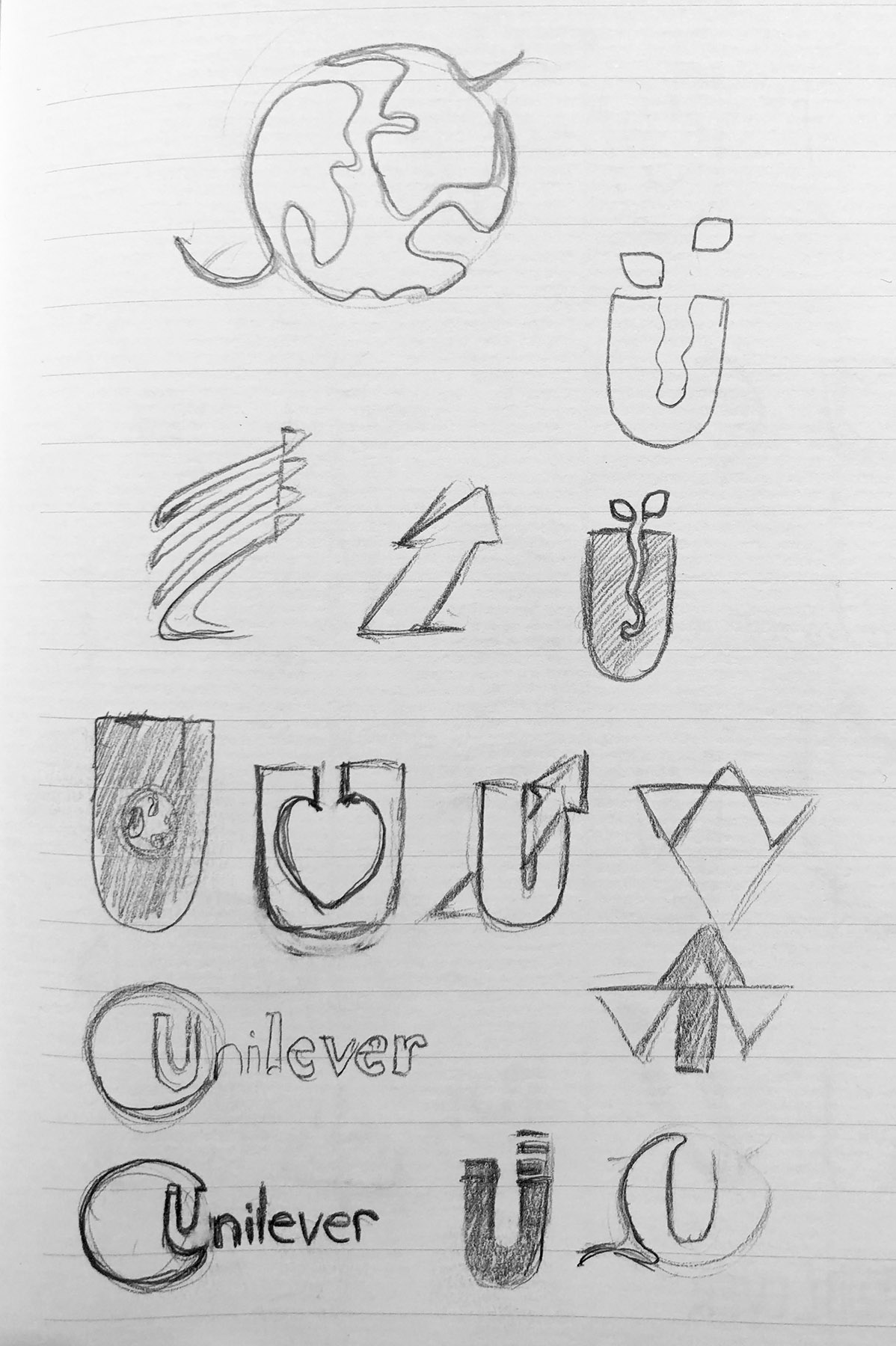
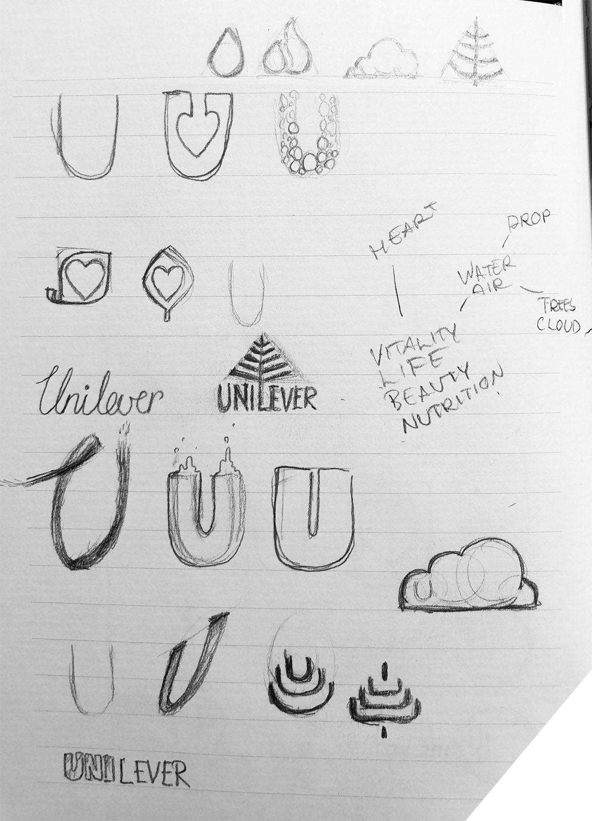
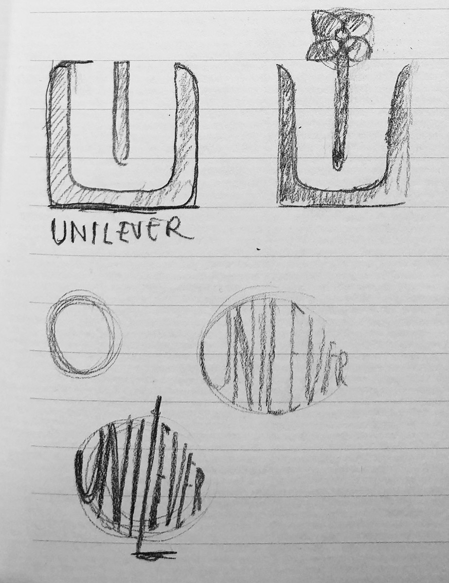
First I started to think about what the company does, and what their values are, and then I started to write down some key words. The sketches went all over the place, so I included the most relevant ones. I wanted to break away from the original design of representing each part of their business, and instead just focus on how they describe their logo: “Unilever is committed to making sustainable living commonplace and our logo is a visual expression of that commitment.” They have also recently started to focus more on beauty and nutritional products, so I played around with that.
I ended up exploring these designs further in Adobe Illustrator, but didn’t feel the colors were right, nor did I feel the planet/circular-logo represented the company. There were also two logos following the Continuation principle, so I had to remove one of them.
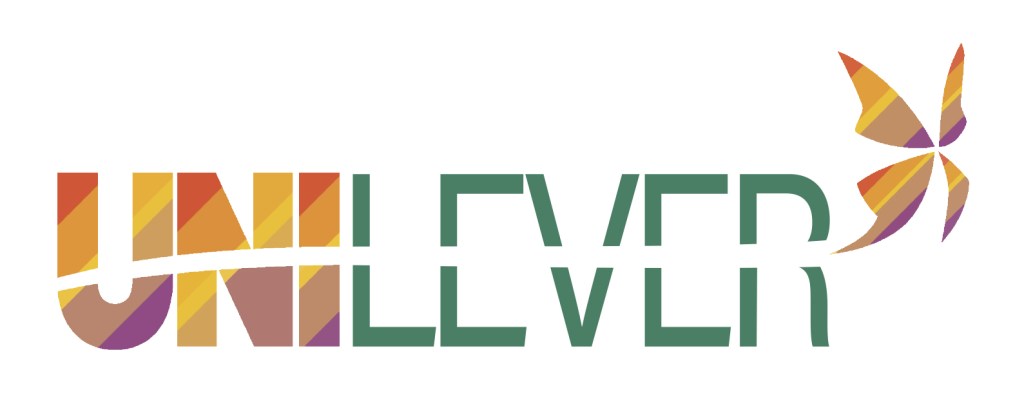
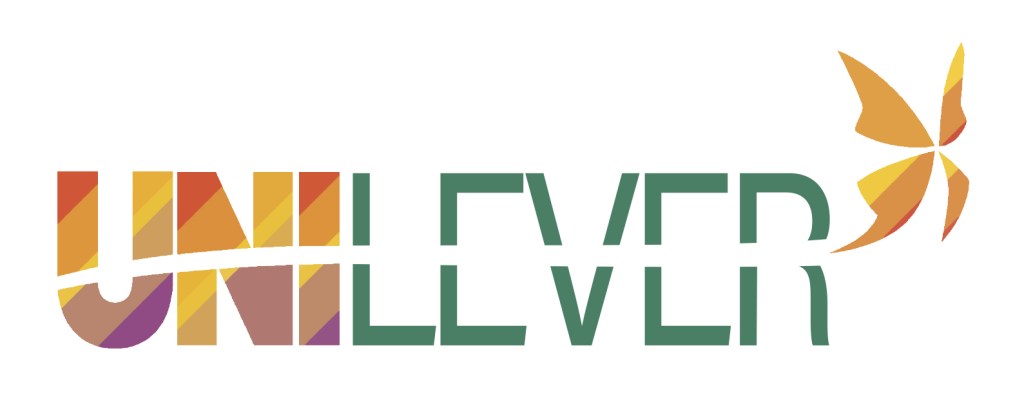
I ended up using colors from illustrations from their web page instead, which use the complementary colors of green, purple and orange, and makes the logo fit in with the rest of their material:

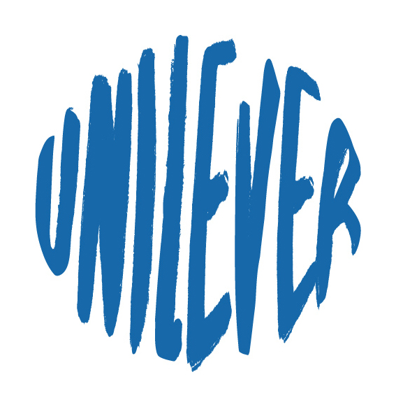
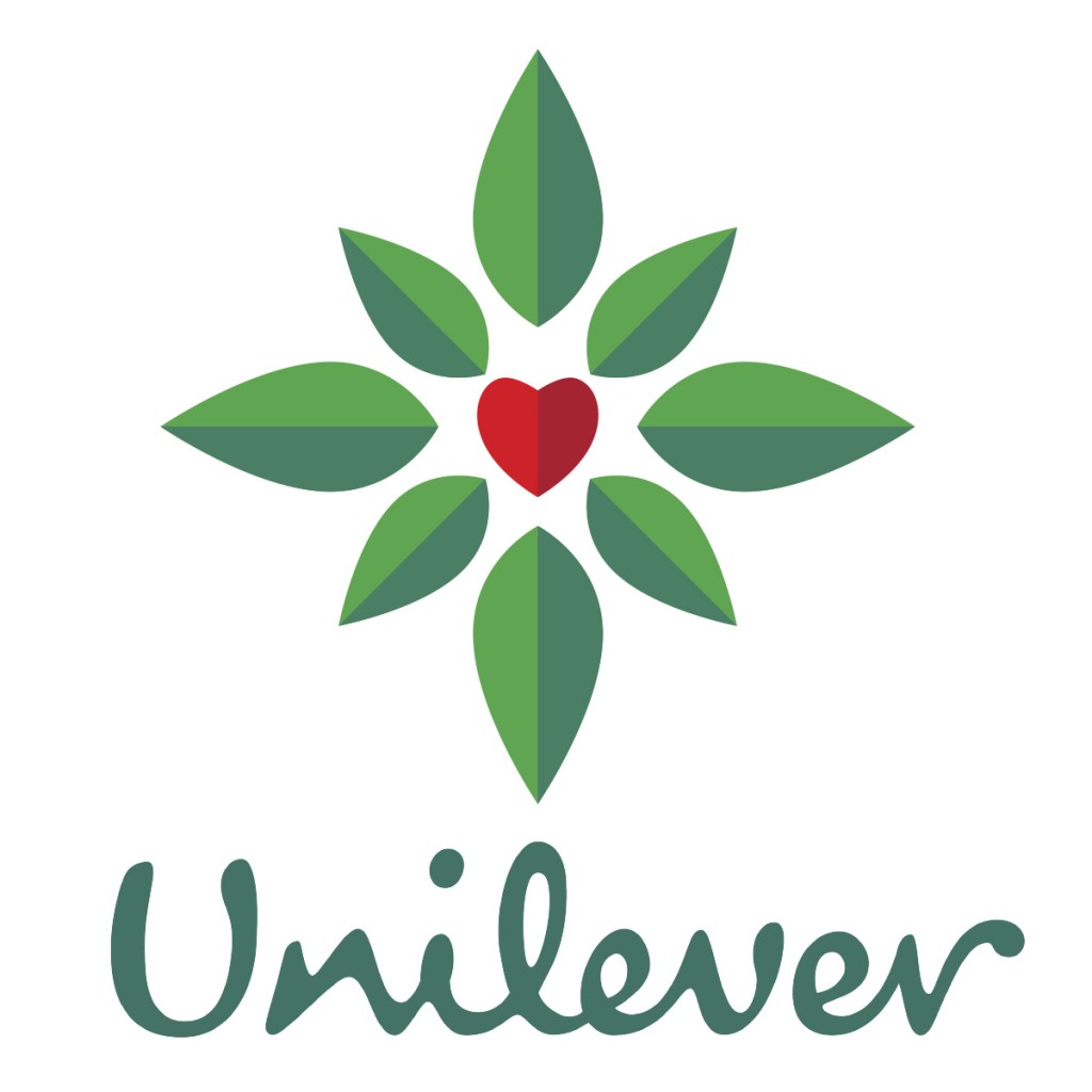
Final logos
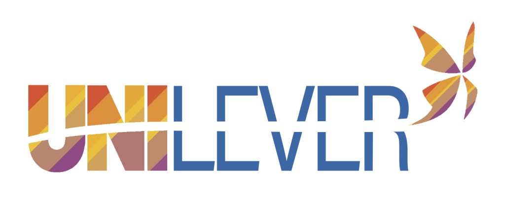
Closure:
This logo has Closure in the space between the N and the L, but also a bit of Pragnänz in the shape representing the planet.
Similarity:
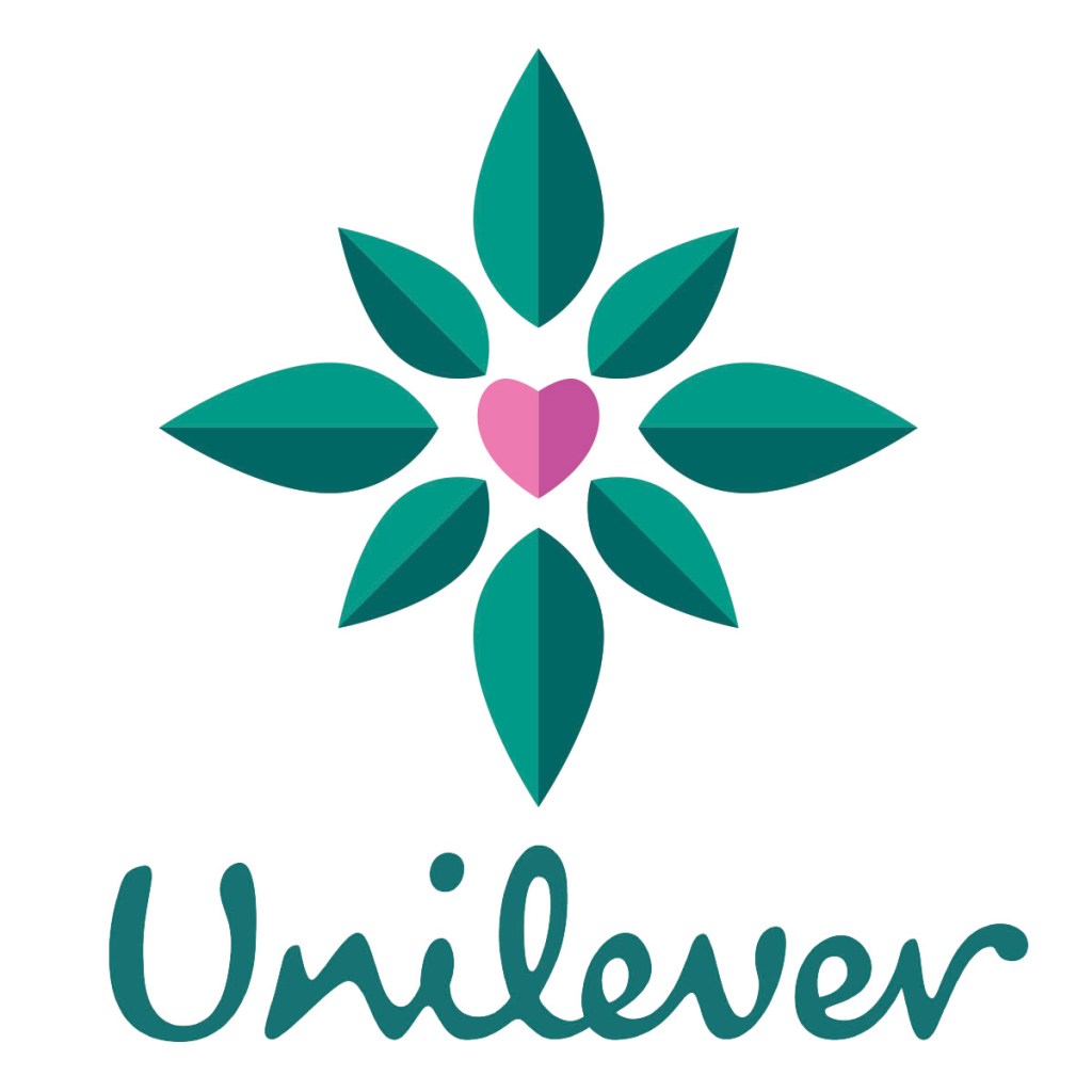
This logo combines a pictorial mark with their typeface. The leaves fit inside a square, and outside an invisible square where the heart is. It is primarily made using the Similarity principle, where the heart is the anomaly. It also uses Pragnänz and Symmetry in the arrangement of the leaves.
It uses colors from the Unilever web page, and is a bit more pleasing to look at than when I used my original colors. It also helps creating unity in the rest of Unilever’s visual elements.
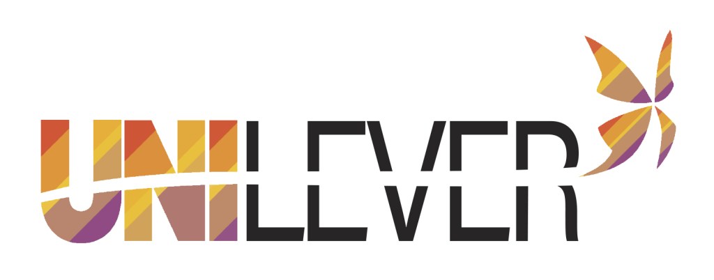
Continuation:
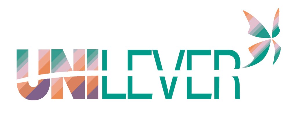
The final logo was made using the Continuation principle, which can be seen in the butterfly’s path through the letters. The butterfly itself might be cliché, but I think it represents sustainability, nature and beauty quite well. The line through the letters breaks up their shapes, and creates Closure.
Conclusion
It was quite interesting to work this way, by breaking apart and putting it back together in a new way. I’m not quite sure if I succeeded in creating a good logo, but I feel like the leaf logo might be the strongest one, because of its simplicity.

Leave a comment