This week’s Learning Assignment had a pretty steep learning curve, where I had to learn how to use Adobe Illustrator, but it was fun. It was SO-MUCH-FUN!
We were briefed to do an illustration for fruit juice packaging, for the made-up product: Loose Juice.
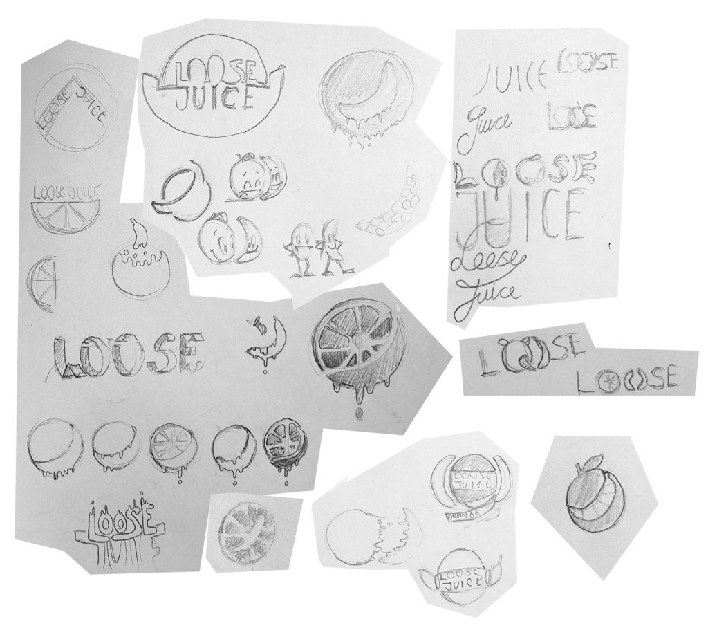
The Scamps
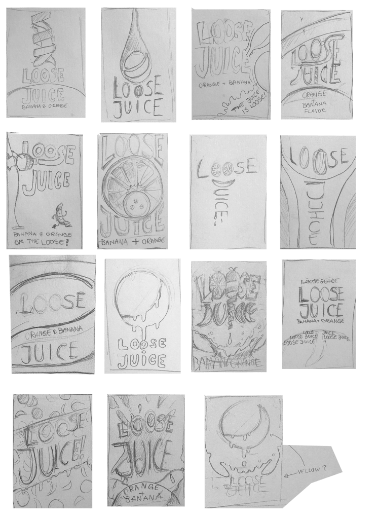
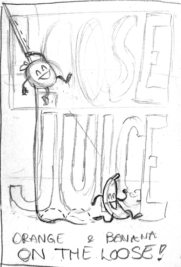
First the scamps, simple, but easy to read product sketches, had to be made. I made 15 of these, along with a few doodles. It was really hard to choose which scamp to proceed with. I really liked the one with the orange and banana slices, as the banana is more commonly illustrated in profile, but the name “Loose Juice” suggested a more whimsical theme. That’s when I started to make “splashy” logos, then started to experiment with fruit characters. I then went back and tried to combine the more elegant designs with the whimsical styles, which is why the orange and banana is “escaping” the frame in one of the scamps. This scamp was the basis for another scamp, which is the one with the orange and banana escaping from somewhere out of frame, and this is how the “on the loose” line came about.
Refinining the Scamp and making the Final Illustration
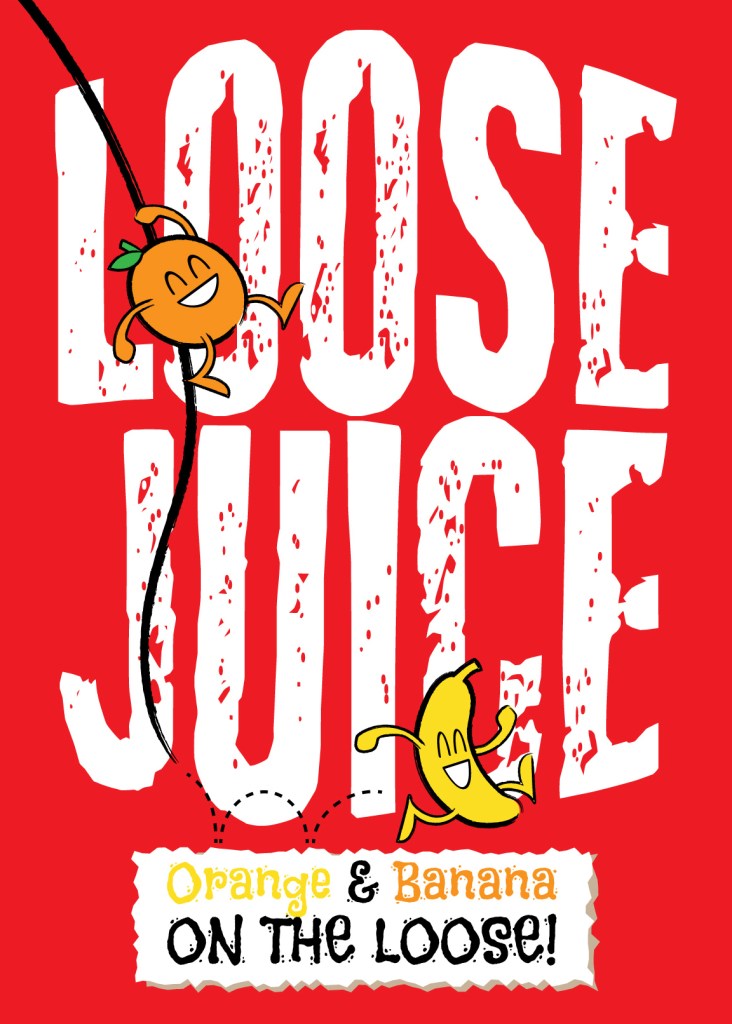
I took this final scamp and made a cleaner sketch, which was divided into thirds, horizontally and vertically (the rule of thirds). This was then imported into Illustrator as the background, then I started to create the objects in the composition. I’m not sure if I’m happy with the color choice for the background, but it works, because red is an inherently dark color, and it contrasts well with the white and the other colors. The lines were made with a rough brush, to emphasize the whimsical theme.

Leave a comment